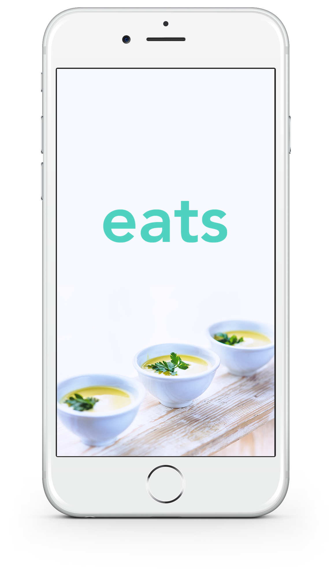
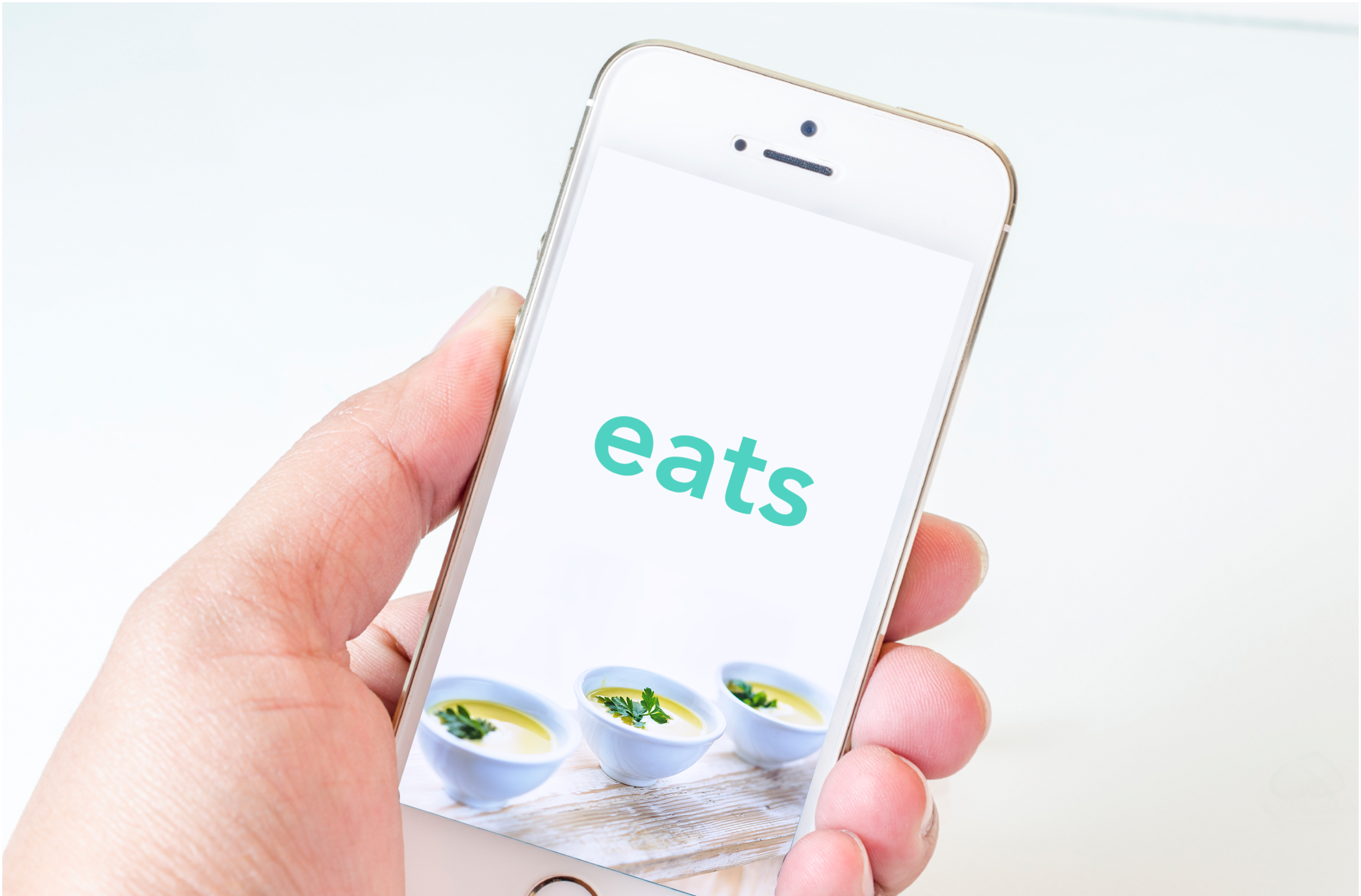
EATS MOBILE APP
UI/UX DESIGN | VISUAL DESIGN
Overview
Everyone has that friend who always knows about the best, latest eats in town. But how can you get in the know too? Eats is a beautiful food app that only shows you the best of the best, so every meal is a great one.
The problem
Existing food apps show you everything - the good and the bad. Why bother with mediocre options? Many of them also have incomplete menus and poor reservation-booking functionality. The world needs an app that makes is ridiculously easy to find, book and enjoy a great eat.
Competitive analysis
There are tons of food apps out there. Understanding the existing landscape helped me recognize strengths and identify gaps (A.K.A. opportunities). I learned that the big ones have an overwhelming number of options, as well as poor user interfaces when it comes to viewing menus and booking tables. The small ones are better about curating restaurant choices, but they lack similar functionalities and geographical reach.

PROS
Easy, point-incentivized booking
Full menus
Curated lists
CONS
Overwhelming number of options
Filters are not prominent

PROS
Curated lists
Pay through the app
Easy booking
"Vibes" filter
CONS
Menu links to restaurant website
Only available in seven cities
Can't filter for price or features

PROS
Extensive filters
Shows recommendations
Quick browsing capability
CONS
Overwhelming number of options
Crowdsourced reviews
Incomplete menus
Busy interface

PROS
Curated lists
"Notable Dishes" feature
"Featured In" feature
CONS
Incomplete menus
Only available in nine cities
Reserve through OpenTable
PERSONAS
So, who would use an app like eats anyway? I developed three personas that add some color to the user base. The personas helped me understand potential scenarios and which features would be most helpful.

USER TASK FLOW
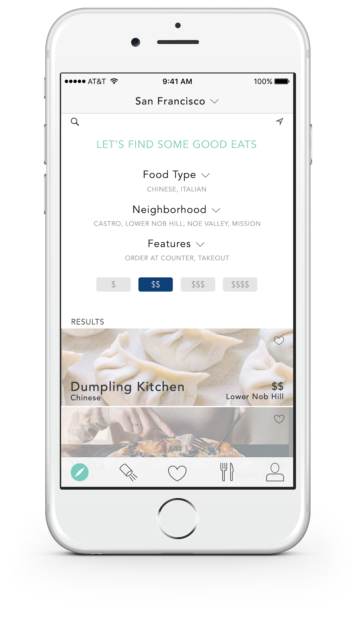
The task flow helped me think through the app's functionality before I mocked up any pages. My goal was to make it as easy as possible for users to choose a great restaurant and make a reservation.

wireframeS
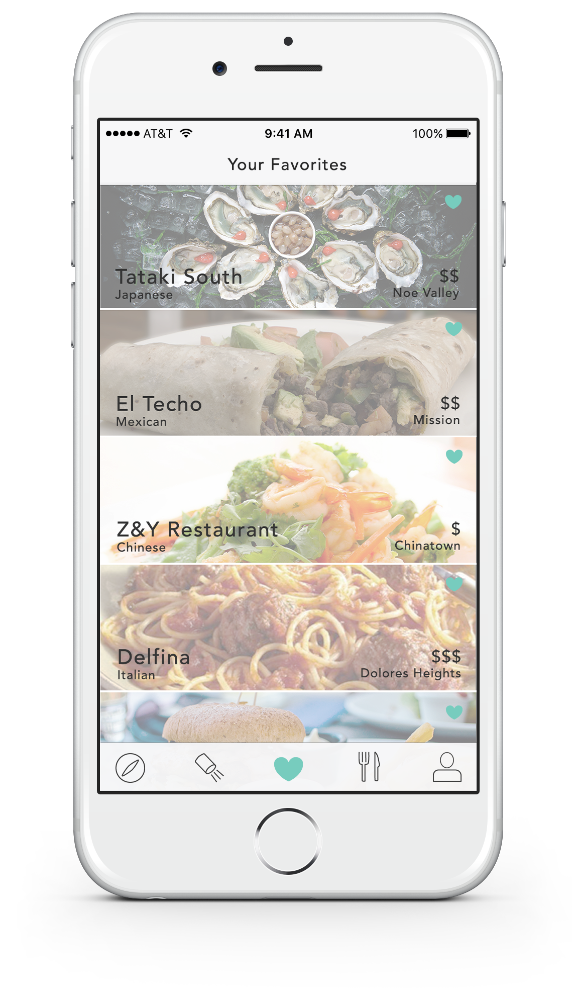
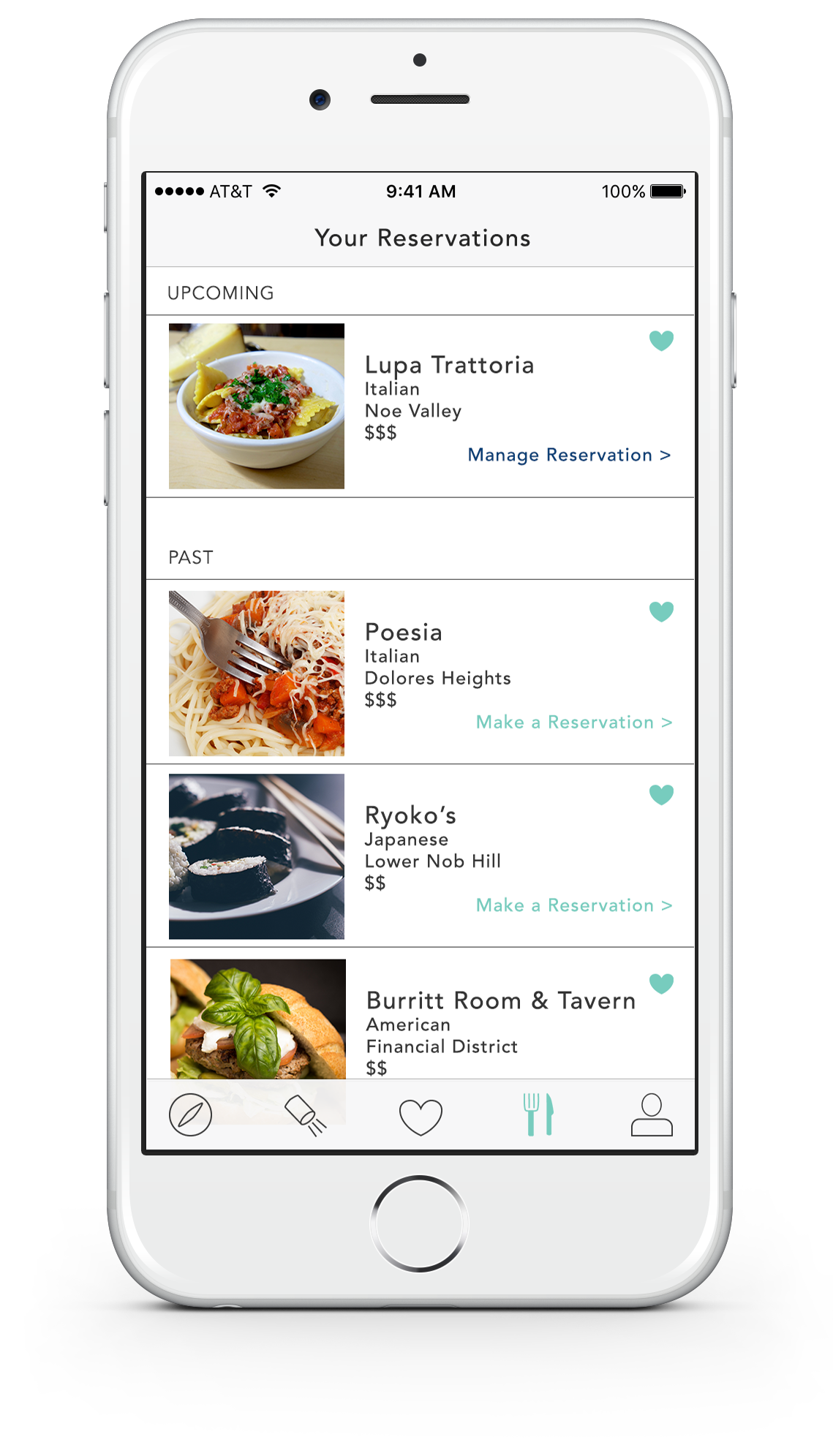
The next step was to visualize the user task flow with wireframes created using the Adobe Suite and InVision.


USER TESTING
I used InVision's Lookback feature to create screen, audio, and video recordings of users. Their task was to choose a restaurant and book a table, and I asked them to talk through what they were thinking as they went. The three main insights from testing were:
The restaurant-finding filters were too long
The app needed search and map features to find specific restaurants and search by location, respectively
One daily spotlight restaurant was great for those "I don't know what I'm in the mood for" moments
PROTOTYPeS
After a few more iterations of wireframes and user testing, the eats prototype was born.